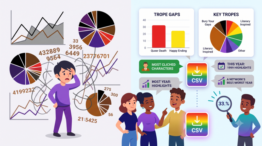
Actually, it’s really “Get ready for the stats being actually functional and usable by people who aren’t Mika!”
Back in March 2016, we introduced our statistics to the world! It’s been a decade and the time is nigh to give that feature a facelift and, more importantly, use it to dynamically tell you what’s been going on.
What Was Wrong
Since we track … well … everything, we can show everything. We have all the basic things to track, like the common tropes and clichés, death, and what shows on-air when. Over time, we expanded that to show you a death ‘timeline’ so you could see how many days passed between characters dying, and a ‘this year’ feature that gave you all the data from a given year.
The problem is there was no context to any of that. If you knew what you were looking for, it was great. But a lot of people just shrugged because the data was just there for you to make sense of on your own. And I don’t blame any of you for ignoring it.
Basically, the problem was we just had way too much data dumped on you, and it was always in the format I found helpful, but that didn’t mean it was actually right for everyone else. After all, I’m a math-nerd to the nth degree (thanks, Dad), but I know that’s abnormal. If I wanted to really make the data helpful for people, I needed to break down what stood out.
What Was Changed
This actually started when one of our editors asked me about “Most-Cliched Characters.” I could (and did) make that page pretty easy but it would just be a pretty basic list and count. What if … What if it was informative with a callout to tell you what people probably wanted to know. What if, just for example, you could see the trope gap on TV shows at a glance like this:
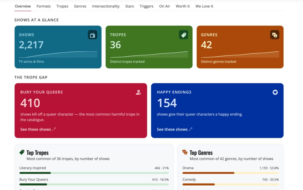
Suddenly there it is in front of you! Nearly three times as many shows kill off a queer vs giving them a happy ending. Also who is surprised that “Literary Inspired” is so high?
As I started to sketch it out, it grew and grew until finally I had a massive refactor on my hands that took about a week. I went through a bunch of iterations, I tweaked the size and fonts and data layout. I also took the time to limit displays. Instead of showing a piechart for tropes with everything listed, making it a brilliant circle of WTF, I trimmed it down to what was important.
Colours and Designs
The layouts got a huge face lift. Picking out colours that caught your attention to where things are important was a huge step forward.
Finally I hit on a design that my wife said was informative for her. She hates math. I consider that a massive win. I ran the design through accessibility checkers and colour tools, and finally have what we have today. I also talked to my friends, who are way better at graphics, and they helped me understand why things worked together. And that gives us a useful, informative, “This Year” page!
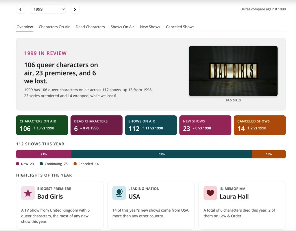
The ‘biggest’ premiere gets called out and noticed, the leading nation and one of the deaths (sorry Laura Hall) are call out. But this information continues, with different visualizations.
Smaller Wins
Depending on your definition of ‘small’ …
- Charts are now rendered without javascript, making it friendlier to screen-readers.
- Less javascript means more speed on every render!
- The whole stats section got a make-over for dark mode as well.
- “This Year” now has a year-by-year navigator, where you can jump to any year.
- Picking a network or a country from the dropdown no longer needs a second click to go, you just jump.
(Un)expected Bonuses
The first bonus came when I was able to speed up rendering by limiting most lists to the top 10 or so. The long tail (which is the technical term) is useful for statisticians but less so for the average queer. That also meant I could quickly display a little more information in one go, since I was only calculating it for a subset. It also let me pull out highlights (like the best year for a network, meaning the year it had the most shows on air) and lowlights (the year a network had the most deaths).
Then I asked myself “What if someone wants the whole data.” We don’t get asked that a lot, and we do have an API, but often the person asking is not a hugely computer savvy nerd who wants to use that API. So now? We have a magic button to download a CSV!

You won’t find the download on every page, mostly on any ‘on-air’ lists, but it pops up in other helpful places. Like the death breakdowns and the full roster pages. So while it’s not everywhere, it’s everywhere that matters.
The power of this re-write made generating a file remarkably easier. The data is heavily cached, so it regenerates once a day at most.
What’s Next?
I’ll be tweaking the CSS as it gets a real world test, and I’m looking for more aspects to make it thrive. Everything here is built to be reusable and contextually smart, so we don’t have to edit on the fly. When the data updates, the page updates. But there are still improvements.
How about death rates? Instead of just “10 characters died on Network Blah,” we could compute something like dead ÷ characters, per network/nation. Why? That would tell you not just that Netflix is the deadliest network because it has the most shows, but the per-capita. If a network has one show and kills off all their queers, they would be far more deadly!
What about comparing the other tropes to death? Is there a singular trope that results in a dead-queer on a show? How about some more deltas? We compare year by year, but only the previous year (meaning, 2019 is compared to 2018). What if you could compare any two years? How about comparing networks and stations?
We could make it easier to share, generating an image you could download for your own site to show off the stats!
And perhaps the biggest idea of all… Leaderboards and slices! We could combine deaths by sexuality, characters by nation and gender, tropes common to shows that kill.
It’s a lot and will keep me busy for a while.
Do you have ideas? I’d love to hear them!