While the little calendar has served well as a static list, I’ve been wanting to improve it to have new views for people who process information in different ways.
I wanted to make it display the local timezone, but we’re not getting that information back reliably from the service we use so it’ll have to wait until I can figure that out.
However now, when you visit the calendar, you’ll have a choice of three possible views:

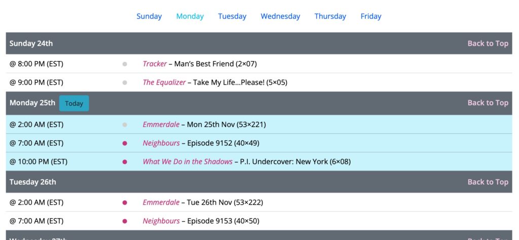
List View
The list view is the old style original list, updated for better dark mode display:

The little grey or pink circle is a visual clue to if the show has aired or not. The current day remains lit in blue, and there’s now a navigation to jump to the day of the week you’re looking for (with today highlight as well).
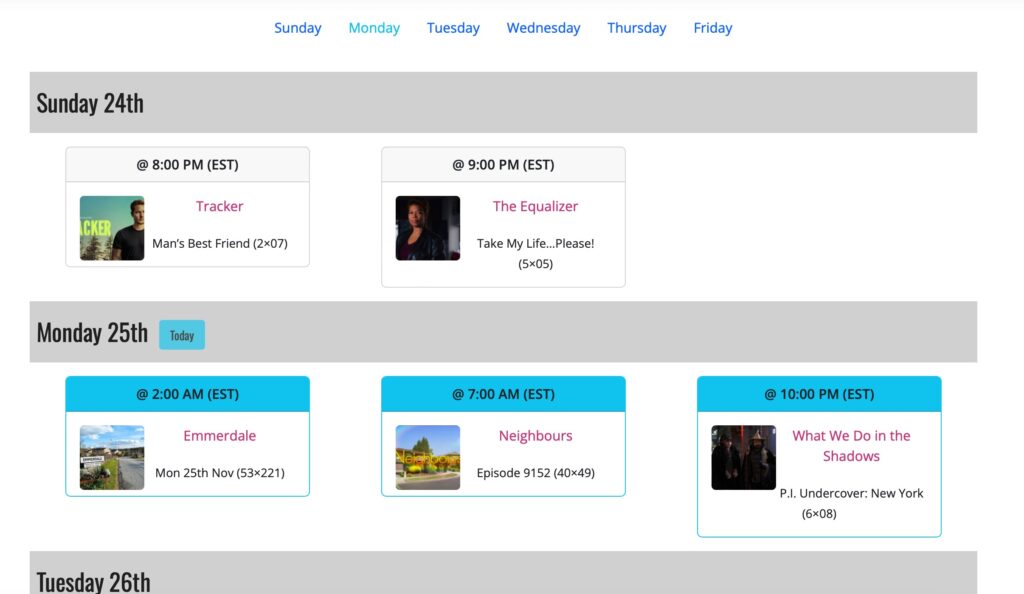
Grid View
The Grid view shows you the shows in a grid with the image of the show:

Again there’s the list of the days of the week at the top, and each day has its own section. Today is marked in blue, keeping that consistent. Instead of the circles, the border color changes from black to grey when a show has aired.
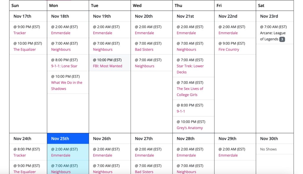
Calendar
Finally there’s the ‘traditional’ calendar view, which shows things in a three week block (last week, this week, next week):

Now, unlike the other views, since we’re always showing empty days of the week, I added in a ‘no shows’ filler for those days.
Suggestions?
If you think of things that could be improved there, please feel free to drop a line in the comments, Slack, socials, you name it. We’re always up for improving the user experience.
