One of the features I’ve been looking to add, now that we have a decent way to track what characters are on air for each show per year, is the automatic graphing of the data. It’s fine for me to plunk numbers into Google Docs and generate lists and graphs, but I always want this to be easier for anyone else to get at the data and play with the numbers. The second step to that process is the new graphs you can find on the site.
Characters Per Year
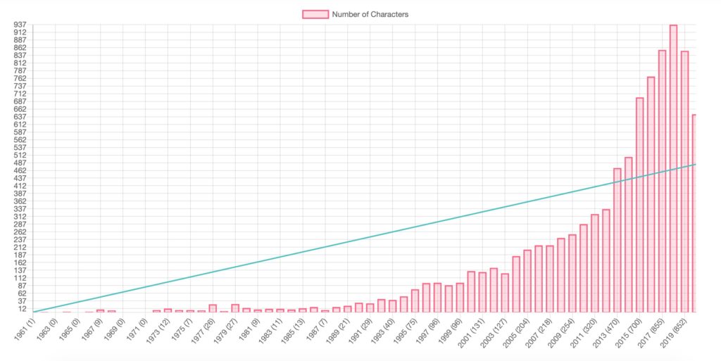
On the Character Statistics page is a new sub-section called “On Air“, where you can find this graph of characters per year. This screenshot is from the dev site, so it’s about 2 months out of date right here, but the numbers are pretty close to accurate. You can see that since 2018, the number of characters on-air has started to drop. 2020, the last item, is lower than expected, though we can blame COVID for that one.
Shows Per Year
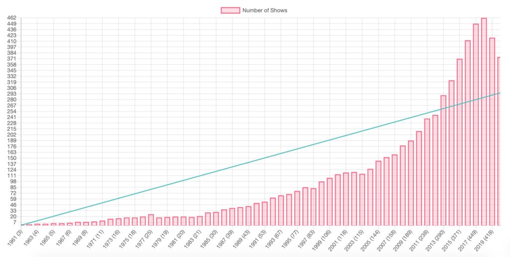
On the shows page there is also a new sub-section on “On Air” (below the pie-chart showing you the percentage of all shows) and, similarly, it shows you how many shows are on air for each year. And no, you’re not hallucinating that drop either.
But wait…. there’s more!
Shows Per Year Per Country and Per Network/Station
Want to know how many shows are on air for each year in each separate country or network? Like … how’s the USA doing?
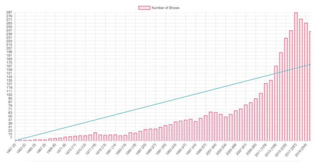
Yeah, I got you like that.

Now some of the stats look a little odd like NBC’s on air chart, where you might expect the trend to drop more, but it’s actually still going up:
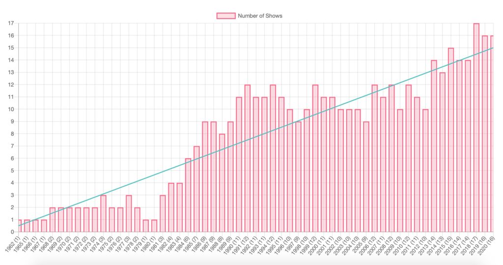
But the cool factor is that the graph only shows the years the network (or nation) has actually had shows on air! Which means you also get the CW showing it’s superiority.
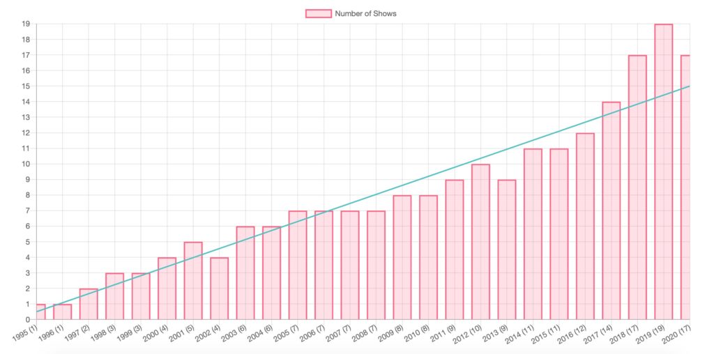
Also yes, I fixed the weird wobble with trendlines.
Are There Stats You’d Like to See?
None of this would have been possible without viewers like you!
Give a shout in the comments, come to our Slack and speak up, or if you’re really into coding, Pull Request are always welcome.
